Introduction
YouTube has grown into a major source of information over the decade, with its main attributes being selectivity and anonymity.
According to a study by G.Stocking et al.(2020),
a quarter of US citizens consider YouTube as being an important news outlet.
And with technology becoming more accessible year after year, the user rate for YouTube has naturally grown.
Roughly 30% of our global population has used YouTube for a wide variety of unknown reasons, and these numbers are expected to grow every year.
Below we present some user information from the Global Media Insight group where we obtain our following statistics and future forecasts of global YouTube usage.
What we see above is not very shocking due to the increased digitization of our modern world. However, this massive usage rate across the globe leads us to ask what exactly is YouTube’s intended purpose. According to YouTube itself, quote,
Like most online platforms, YouTube has great intentions for its service, yet it still provokes numerous consequences.
One major concern for a video-sharing platform with no uploading rules is the regulation of content and who it's able to reach through its service.
It is safe to say that our generation has become “numb” to the internet, and these concerns often get overlooked.
We have become so numb to the point that we underestimate the internet's true capabilities of spreading any type of possibly non-factual malicious information anywhere.
But why is this a concern if there is no harm associated with it?
To answer this, we redirect your attention to the second graph, which extracts YouTube’s usage by country.
This is very informative because we can see how dominant the platform has become in various countries relative to their population.
It has come to the point that even YouTube Creators have noticed this incredible reach and have exploited it for the better and the worse.
For example, Donald Trump’s advertisement team pumped out numerous YouTube advertisements and videos during his 2016 presidential campaign, knowing that nearly 75% of Americans utilized YouTube routinely.
So with information sourced from Demands Age, we plot the top 15 countries that have the highest YouTube usage along with their relative population.
While these two introductory histograms are telling of YouTube's surge throughout the years, it remains difficult to map what type of information users access from this web service. However, instead of pondering on what we don’t know, our project focuses on what we do know: which are the “momentous” events/trends that occur within our daily lives that help develop our growing human history (e.g. Fortnite, Ebola Epidemic, TikTok, etc.). Therefore, our project aim is trying to answer whether YouTube is a mirror of our society? To obtain a proper answer, we will prioritize the two following methodologies to conduct our analysis from our YouTube dataset:
Textual Analysis
In our YouTube data, we will be working with a dense amount of textual data. Therefore, we will first conduct an N-gram analysis, which will help us highlight meaningful words and word pairings to identify “trends” or word(s) that appear frequently across videos. After doing so we will also run the Latent Dirichlet Allocation which is a statistical generative algorithm that will group our words and give prevalence and saliency to specific words based on their probability distribution.Time Series Analysis
In the second part of our analysis, we will determine the density of specific “events” across our available time series. For example, if the COVID-19 vaccine was developed in 2020, we are curious to see if keywords like “COVID-19”, “vaccine”, or any words associated were seen across more videos during that time period. We try to pick events that are drastically different in category to get a good idea of the spread and diversity in the coverage of different historical events and their prevalence on YouTube.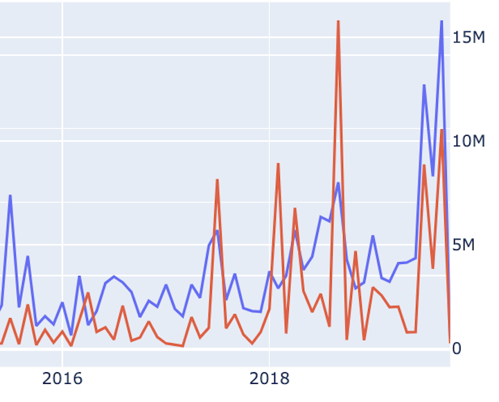
Our data in numbers
Here are some of the numbers from the YouNiverse dataset.
Number of YouTube Channels
Number of YouTube Videos
Memory Size of Compressed Dataset (GB)
What is YouNiverse?
In our project, we leveraged the YouNiverse dataset, which is a large collection of the channel and video metadata from English-language YouTube.
This dataset comprises metadata from over 136k channels and 72.9M videos published between May 2005 and October 2019, as well as channel-level time-series data with weekly subscriber and view counts.
Within this dataset, we also get information from the online service Social Blade, which allows users to assess and enhance the representativeness of the sample of channels to rank channels accordingly.
YouNiverse is publicly available and more information can be found at this link.
Meaningful Data from Youniverse
Amongst the Youniverse dataset, the most critical component of our analysis lies within the YouTube metadata.
In this metadata lies a lucrative amount of features, but the ones of interest for our analysis are the categories, description, title & upload_date.
We briefly describe each of their value in our analysis pipeline:
categories - In our analysis, the categories feature allows us to look at specific video categories to filter out our data.*
description - the description feature gives us the meat of our text data which describes our video.*
title - The title feature is also critical to our analysis as titles are what attract users to click on videos.*
upload_date - In our time series analysis, we often filter our YouTube videos by year to get the videos associated with the proper time frame.
Within our data analysis pipeline, we have several data-generating code blocks that take the yt_metadata_en.jsonl.gz JSON files and extract the information needed to run our analysis.
For more information on the preprocessing, please check out our links section which contains Jupyter notebooks that are annotated for the readability, usability, and reproducibility of our results.
N-grams
Our primary task at hand is working with the textual data that is made available from the title and description of each YouTube video from our metadata.
These features give us an idea of what the YouTube videos are about and help us contextualize specific subjects relating to the video.
Therefore, one of the most common and simplest methods in natural language processing when working with a massive corpora (collection of written texts) are N-grams.
In N-gram analysis, we select a number N which will take N sequential words and form a new corpora of all the possible N-long word pairings.
Take a look at the pseudocode below which covers a very basic example:
-
# if N=2 sentence = “I was happy”corpus = [I_was, was_happy]
You can then count the frequency that these word pairings have formed to assess trends across our text data.
So in summary at a high level, we are breaking down large portions of our corpora data into more meaningful segments (N-gram) that help to identify the root cause behind what we call “trends”.
So in our project, we took a particular emphasis on working with the Politics & News YouTube category.
Because textual data is often quite noisy, and a lot of preprocessing is required, we thought it would make sense to focus on one particular YouTube category.
So in our analysis, we cleaned up our 2005-2019 Politics & News related videos by removing all stop words (English and custom stop words), URLs, emojis, and punctuation.
We then formed unigram, bigram, and trigram corpora.
Once these steps were completed, we took advantage of the word cloud python framework which allows us to plot the most popular N-grams determined by their size and their boldness.
Below, you will see GIFs of our Politics & News specific word clouds.
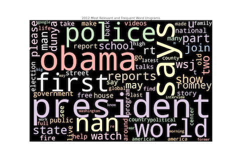
A closer look at 2016
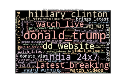
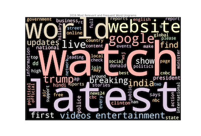
2016 was a big year in the Politics & News world because of the contentious presidential election between Donald Trump & Hillary Clinton.
Involving third parties like Russia and others, we expected that our N-grams would put a particular emphasis on these events.
Interestingly enough, we found that the unigram was not very informative of the political landscape from that year.
The trigrams were also uninformative, so we did not picture them in this analysis.
While we expected words like “trump” and “clinton” to be dominant within our unigrams, we see that words with little relevance like “watch”, “latest”, and “world” were considered the trendiest words.
This is just one of the many challenges of working with textual data but also highlights the inability of unigrams to capture trends.
While the unigram (& trigram) analysis was rather uninformative, we can see that the bigrams were able to capture more, simply by changing this hyperparameter N to 2.
Words like “donald_trump” and “hilary_clinton” did make a bigger appearance across all YouTube videos from this year, and we think it's a better demonstration of this political year.
In addition, something interesting we found was India’s YouTube presence that starts to become frequent, especially in recent years.
And this is correlating to our first plots describing YouTube’s usage by country.
Therefore, words like “hindi”, people like “prasar_bharati” and channels like “india_24x7” made a substantial appearance across Politics & News YouTube.
2016 YouTube Titles and Descriptions of videos containing the word India
Word Salience through Latent Dirichlet Allocation (LDA)
In the next major component of our analysis, we take on a more sophisticated method from natural language processing known as Latent Dirichlet Allocation (LDA). LDA is a generative statistical model that explains a set of observations (in our case, a dictionary of words) and produces a distribution of groupings over the items being clustered. So while it sounds very much like a clustering algorithm, we can think of the algorithm as assigning a probability that a word belongs to a topic vs. a word belonging to a cluster. And while the use case for this method is typically for topic modeling, we are going to leverage this algorithm to group together salient (most noticeable or important) keywords and provide an adjustable relevance score to particular words within a topic. Before we discuss our LDA model, we would first like to discuss the algorithm in greater detail in the context of our problem.
LDA Algorithm
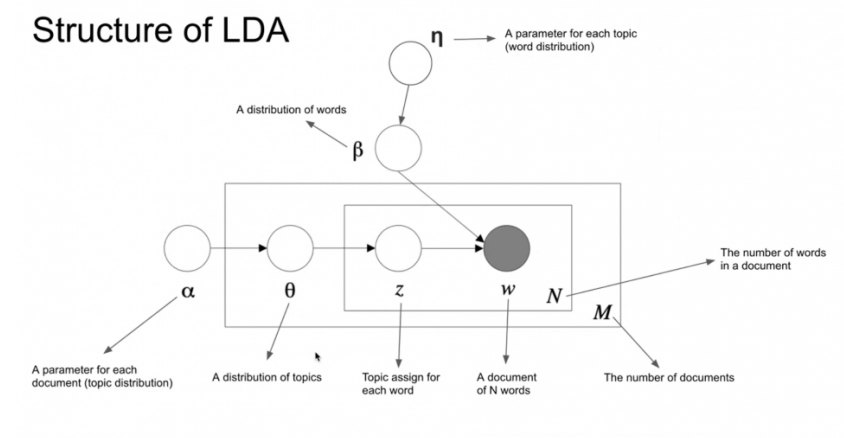
2. We then go through each document (YouTube videos: title + description) and randomly assign each word in the document to one of the k topics (k is chosen beforehand). In our case, we chose k = 15, because there are 15 YouTube categories in our dataset.
3. Next for each document d, go through each word w and compute:
Politics & News topic, it is more probable that these words belong to the Politics & News topic.
b. p(word w| topic t): Calculate the proportion of all the assignments of a given topic over all documents that come from a specific word. This tries to capture how many documents are in topic t because of the word w. And since LDA visualizes documents as a mixture of topics, we can imply that the topics are a mixture of words. So if the word
“Donkey Kong” has a huge probability of being in the topic Video Games, all the documents having this word will strongly be associated with this topic as well.
Similarly, if the word “Fauci” is not probable to be in the topic Music, the probability assigned to “Fauci” will be low because the rest of the words in the document will belong to some other topic and hence the document will have a higher probability for those topics.
After computing the probabilities of each word, we arrive at our completed LDA model.
Computationally, we were able to achieve this by using the gensim framework, which prepared our documents and fed them into the Latent Dirichlet Allocation model to be trained.
Once training was completed, we took advantage of the LDAvis Python framework, which provides us with an interactive plot of our topics and relevant/salient words associated with each topic.
However, for the sake of time and our sanity, we would like to note that the LDA model was trained on a random sample of 1,000,000 YouTube videos.
Since the training was done on our local machines, our memory (RAM) plays a significant role in its time complexity and with just 8 GB of RAM, we did the best we could.
(Note that although 1,000,000 videos feels like a small sample size, the dictionary built from a corpora of 1,000,000 videos can be possibly exponentially larger.)
Below, you can interact with our latent Dirichlet Allocation model.
Salient Groupings Description
After reviewing the results of the LDA Model, we see the 30 most salient terms in our sample of 1,000,000 videos.
In addition to the top salient words, we decided to provide a general "topic" look up table for each of the 15 topics to clear up any ambiguity:
"star", "war(s)", "film" implies perhaps a movie related topic.
2. Vlog/Family: The terms
"guy", "baby", "home", "vlog" may imply a family/vlog topic.
3 Video Games: We see a clear indication of video games with terms like
"minecraft", "xbox", etc.
4. Music: YouTube has a strong prescence of music related videos and these terms indicate it being a music topic.
5. Product Reviews: Review videos are also a mass presence in YouTube. Terms like
"amazon", "review", "android" implies a product review maybe even related to the latest tech.
6. News(?): Though not exactly clear, terms like
"trump", "police", "president" might imply a news related topic.
7. Finance/Stocks: We see an interesting example of the LDA here. Its clear it is a finance related topic but because the video game
"mario" collects gold coins, his probability distribution makes it into the finance topic.
8. Tutorials:
"makeup", "food", "guitar" are clear words that imply tutorial/lesson based video topic.
9. Children(?): Once again not totally clear but the terms associated give videos relating to children.
10. Miscallaneous: We see a wide variety of topics here. This implies that the algorithm couldn't find 15 distinct topics amongst our sample of 1,000,000 videos.
11. Miscallaneous 2: We see a mixture of video game topics (
"roblox", "yugioh") as well as country related terms ("gandhi", "kenya").
12. Vehicles: Though there are some words that do not belong, terms like
"truck", "use(d)_cars", "ford" imply a vehicle dominant topic
13. India based videos: We see a lot of terms related to India and we have seen in previous sections that India widely uses YouTube and has a massive prescence. The algorithm also suggests that a mass of videos is worthy enough to supply a distinct topic.
14. Africa based videos: We see a strong association of terms relating to Africa in this category implying that African coverage is popular amongst videos.
15. India based videos 2: Similar to Topic 13.
So while most categories were mixed with various topics, we could also distinguish clear "categories" in the terms which had wide associations to specific subjects. Therefore through this more sophisticated LDA algorithm, we got to see what words were salient across Youtube videos. While there is a chance for a poor display of words across all Youtube videos in our dataset, we believe that most of the topics that the LDA algorithm was able to generate were representative of Youtube.
Time Series Analysis
After gathering frequent N-grams and the most salient terms, we also analyzed their occurrence throughout time and tried to contrast them to real life events that happened off screen. Our analysis allowed us address some of the following questions:
* Is YouTube biased towards a specific region of the world or a specific category of information?
* If an event is periodic such as the Olympics, or US elections, does that appear in the content created by YouTubers throughout the years? Can we observe a repetitiveness in the emergence and popularity of such topics?
Our Time Series Analysis results are compromised into several interactive plots, with each plot representing a chunk of data corresponding to a specific video theme (e.g.“COVID-19 Vaccine development”).
As a result, we first filtered our youtube video data when it included a list of keywords (e.g. “COVID-19”, “vaccine”, “Fauci” ) associated with the theme either in the description or the title of the video.
Then, within each filtered chunk, we counted the number of videos from that theme by the upload month across our time series (2005-2019), as well as the number of views.
5 main themes were chosen from the Wikidata which we thought would provide comprehensive and interesting results: Health, Sport events, Trends, Politics, and Technology.
And under each of these main themes, specific events were chosen to be analyzed.
For each specific event, a plot of the corresponding yearly number of videos uploaded and the number of views was conducted.
And, for each main category the same plotting strategy was adopted. This helped us identify if popular content on YouTube was diverse, and whether the coverage of offline events is similar for all types of events or not.
Additionally, within the same main themes, it helped us identify whether specific events caught more attention than others. (e.g. if people are more drawn towards a specific aspect of the mentioned category).
Discussion
We now present the results and discuss whether they address our questions for the 5 main themes that were explored in our analysis.
We try to idenitfy the different types of peaks that may have occurred (e.g. periodical popularity, temporal popularity, or progressive popularity) as well as an explanation of the current events that may correspond to these peaks.
The graphs were not log normalized so, some topics may not exhibit fluctuations at first sight, but since they are interactive, users may play around with the time series to gain further insight to events.
Health
In the case of health for example, a delay of 2 years was observed before the drastic increase in coverage of “ebola”.
The drive of content creation regarding the subject started increasing around May 2014 and then reached a peak around the end of that year only to then decrease suddenly in the beginning of January 2015.
For all other periods of time, it stayed quite low knowing that the outbreak occurred from 2013-2016.
The increase in content was also accompanied by an increase in the number of views which reached a peak around the end of 2014 and then again around the end of 2015.
What we find to be interesting is that although the big Ebola outbreak occurred in a limited time period, the subject emerged again around 2018-2019, and also caught the attention of viewers at that time.
According to our independent research, a localized Ebola outbreak happened in Congo around that period.
One thing that we thought of in this case is that the Ebola outbreak occurred and was mostly prominent in Africa initially, a population that doesn’t have access to technology as abundantly as European and American communities which would explain the initial delay in coverage of the topic.
However, the second peak observed in both the content creation and number of views can be analyzed as some sort of sensibilization to the topic due to previous exposure and popularity.
In regards to Politics, we chose to analyze first data related to Climate change, a topic that has been tackled and resonating for quite some time.
According to the collected and clustered data, we can observe a slow and steady yearly increase in content related to the topic.
This was accompanied by a similar behavior with regards to the number of views. An extreme peak around September 2019 in both content and views was observed which could be explained by the climate strikes that started during that period.
An interesting thing observed however, is the early peak in the number of views of such videos around January 2013.
During that period content coverage wasn’t pronounced but this didn’t stop viewers from searching for information on the specific topic.
In fact, during that period several floods, high temperatures and heavy rains occurred and were covered by news outlets which could be the origin which sparked the interest of users on YouTube.
However, this collection and analysis of data shows that in regards to this topic, YouTube eventually started to consider it important to cover and increased the reach of Climate change-related issues on the platform when the rest of the world started giving it increasing importance which means that they conformed to what was happening in society.
And, it does as well show that YouTube is a platform that people go to to gather useful information on such a topic.
Sports is a broad topic that includes several different types of events. In our case we studied videos related to the World cup, the NBA, the Olympics, Tennis, and Baseball.
In regards to technology, the events we chose to focus on are iPhone releases and Electric cars.
As we may already know, trends rise, take over the Internet, then fade out from the public eye after reaching a peak.
Throughout the years, there were several memorable trends, which made us question whether YouTube users and content creators were actively part of it.
The trends that we chose to analyze are: Gangnam Style, a song that became viral in 2012 and broke several records, Clash of Clans and Fortnite, which are popular as game references, How-to videos and the Paul brothers.
To conclude, YouTube seems to be actively covering events that happen off-screen, although the view counts and video uploads did not perfectly align with the timeline.
We were able to examine the sensitivity of YouTube regarding trends and events while picking keywords that are expected to gain periodical popularity(e.g. the Olympics, the World Cup), temporal popularity(e.g. Ebola virus), or progressive popularity(e.g. Electrical cars).
The results corresponded to our expectations indeed. However, view counts and the number of video uploads aren’t enough to determine whether Youtube is the mirror of society, since the numbers only cover one aspect of the platform, further investigation is needed.
While our initial analysis helped provide insight into our original question, we also see room for expansion to explore even more alleyways to provide answers to our question.
For further development, we could explore other social media datasets that span over the same time period in comparison to YouTube.
Reading the different tendencies of social media platforms to focus on specific topics could be an interesting lead.
For example, YouTube might be considered as the “goto” platform regarding technological advancements, whereas Twitter could be the one for news and politics.
Another factor that could be explored is the geographic popularity of YouTube.
It would be interesting to study if some issues take more amplitude in specific geographical regions than others.
Is YouTube considered a globally popular source of information or is it limited to a few countries?
Ultimately as students, we were constrained by other obligations and time allotted to us, but we feel great about what we were able to accomplish from this lucrative dataset.
Therefore in totality we are greatful to have conducted enough data anlysis to allow us to address our question based on some of the things covered in the ADA course.
So we thank Professor Bob West and the ADA team for all the help throughout this winter semester!
Just 4 Life Science Students working on a Data Science Project...
Data Scientist
Data Scientist
Data Scientist
Data Scientist
This link takes you to our Repository of Data, and Jupyter Notebooks used to generate our data.
In the case of the flu, the flu is a yearly recurring and common disease which did not see a lot of content coverage before 2011.
However, content creation related to the flu started increasing almost steadily from 2011 till 2019.
What is interesting to analyze is the quite elevated peak observed around the end of 2009 compared to the number of videos covering such a topic at that time.
The close-to-constant increase in content was accompanied obviously by an increase in the number of views, however, the ratio of the number of views to the number of videos created is the highest before the abundant coverage and before the increase in the numbers.
From independent research, the emergence of flu during that period started out in the US.
This would lead us to hypothesize that the US population relies a lot on YouTube for information although content creators didn’t find it necessary to increasingly cover the event at that period.
This however, did not decrease from its popularity on the platform.
In particular to health, we can safely say that the increase in the number of views on videos shows that a lot of users go to YouTube when searching for information to understand a certain health-related event occurring in the world.
However, coverage wasn’t as reflective of the period or occurrence of the said topics which exposes a limitation as to how much YouTube is able to reflect what is happening offscreen.
Politics
In addition to climate change, we decided to go over the US elections, a periodic, globally impactful and covered event.
According to the plots, the topic’s coverage varied and increased throughout the years.
The noticeable thing is that before the 2016 elections, no remarkable change in content and views was observed even during 2008 and 2012 election years.
In fact, the 2016 elections gained a lot of traction around the world because of the running of Donald Trump, and him being a public figure before that.
A possible explanation for the sudden urge of coverage could be the previous involvement of Donald Trump in the media scene and his wide usage of the platforms for his campaign.
Unfortunately, data for the following presidential elections of 2020 was not provided in the dataset to detect a periodicity in coverage and viewing behavior.
To no surprise, we noticed that coverage after that period and the interest of users decreased but not significantly, and even a few peaks sparked and could be correlated with the launching of the following campaigns or a few aftermath events that occurred.
However, such conclusions cannot be verified. We predict that a periodic pattern would be observed in the 2020 election period.
Hence, for the purpose of our project, we can say that the dates of content creation and publishing are more accurate when political topics are involved.
Additionally, such topics show a great reach on the platform.
In regards to politics, YouTube can be considered a robust platform of information and its usage for that purpose is apparently supported.
Sports
Starting off with the global comparison of all sports events, we notice first that the number of videos created related to such events are quite low (max of 6.6k for the Olympics).
With such a comparison we can also see that the amount of content differs between events.
It is lowest overall for Baseball, followed by Tennis, the NBA, the World Cup, and Olympics, however a few specific dates alter the order such as June 2014 and July 2018 which put the world cup ahead of the olympics which is explainable by the fact that a World cup was happening at that time.
It is however safe to say that content on YouTube leans towards specific events even in the same category.
As for the number of views, more fluctuations are experienced throughout the years and numbers are extremely high (reached 147M for the World cup).
Additionally, views related to Tennis and Baseball are low, reflecting the content as well and the lower coverage of such events in comparison to others. Plus, the overall order for the number of views is observed for the events but is much more intertwined between the World Cup, the NBA and the Olympics.
Hence for the purpose of individual analysis, we will be focusing on the NBA, the Olympics and the World Cup.
The NBA is the National Basketball Association based in the US which organizes leagues yearly.
According to the data gathered, NBA related content has increasingly been posted throughout the years.
The peaks observed yearly are mostly around March of every year which marks the near-end of each NBA season and the dates with some of the most important and looked for matches.
On the other hand, the number of views is not periodic and fluctuates all throughout the analyzed time period.
There is a noticeable peak that was observed in January 2011 during which the content amount was quite low due to a midseason lockout but it maintained a rise in views shortly after.
No other noticeable event occurred according to our research during that time period.
The data gathered showed that even though the amount of content related to such a topic is low, it doesn’t stop people from referring to YouTube when searching for videos related to the NBA.
In relation to our question of showing whether YouTube is able to reflect what is happening off-screen, it does to some extent, due to the periodicity in content posting but not as popularly as other topics.
This could be due to the fact that while it is globally explanding, the sports event occurs only in the US and is not accessible to many content creators due to copyright claims.
The World Cup is mostly popular for football/soccer, however, other sports hold world cups as well.
This would explain the lack of periodicity in the data gathered whether for the number of videos posted or for the number of views knowing that the FIFA world cup is an event that occurs every 4 years.
The highest peaks however, seem to correspond mostly to the years where cricket and FIFA world cups were held.
The amount of content however is still underwhelming knowing that the term involves several sports with a high reach as they involve several countries.
The reach is reflected in the data by the high number of views.
What could explain the low content is the fact that these events occur in specific regions of the world so not many content creators have access to cover the event.
All in all, we can still say that people go to the platform for information on such events and that YouTube to some extent reflects the occurrence of such an event but again not as abundantly as other topics.
The high number of views could also be coming from the fact that many people don’t have access to watch such events otherwise, which shows their trust or intuition to refer to YouTube in such cases.
Finally, the Olympics is a periodic event that takes place every 4 years.
However, the Olympics come in two forms: the Winter and Summer Olympics.
In the 2000’s, the Winter Olympics were held from 2002 and the Summer Olympics from 2000.
According to our data, the first peak of video uploads was reached around July-August 2012 which corresponds to the 2012 Summer Olympics period.
Before, the content coverage was insignificant.
The second peak is found around February 2014 which corresponds to the Winter Olympics period.
Another noticeable peak was found in July 2015, during the Special Olympics.
The peaks that were found in our graphs perfectly align with the Olympics timeline: August 2016 (Rio, Summer Olympics), February 2018(PyeongChang, Winter Olympics), January 2019(periods of announcements regarding the next Olympics), March 2019(Abu Dhabi, Special Olympics.
The final peak was in July 2019 which marked events and visits organized by the International Olympics Committee but not a specific Olympic game.
This in fact showed that YouTube remained faithful to covering Olympic-related news to its users at the time of the event taking place off screen. Moving on to the views, the periodicity isn’t as pronounced.
Overall, the coverage is not as abundant but aligns with the timeline of events.
The reach, nevertheless, has a positive, stable baseline, from which we can deduce that the Youtube audience shows great interest in sports and sports-related content.
Technology
iPhone releases never fail to grab the public’s attention, they are covered by major news outlets, countless unboxing and reviewing contents are released on Youtube.
The data did show yearly reoccurrence of peaks in terms of view counts in August 2012, September 2014, November 2015, November 2016, and September 2017 all of which correspond to iPhone release dates +/- 1 month.
In terms of content, a constant increase in the number of video uploads was observed and peaked in September 2014, September 2016 and April 2018.
In contrast, content creation didn’t peak around the release dates.
However, data did show a prominent, steep increase in both number of views and videos created between July 2018 and February 2019, the release period of 3 X version iPhones (source).
In all, there is good coverage and traction of iPhones on YouTube. More so, an increase of interest in the topic has been observed throughout the years, with the advances in technology.
Youtube has ended up becoming the “goto” platform for information regarding iPhones.
The data gathered for electric cars is quite the opposite.
Regarding the number of video uploads, there are fewer videos compared to iPhones, with significant fluctuation in time.
To start with, the number of content related to electric cars started to slowly increase in 2013 when electric cars were first introduced to the public (source).
The content creation sped up around 2017 and peaked in August 2018 as a considerable amount of electric cars were launched, competing with Tesla, and as sustainability gained more importance (source).
In terms of views, peaks were observed in 2012 and 2013, which could be due to public initiatives of turning large cities electric(e.g. London) (source).
Views peaked in June 2014 as Tesla announced publicizing their patents, then again in January 2016 as electric cars made an appearance during the Paris Motor show (source, source).
Hence, we can conclude that YouTube was able to catch on the trends related to technology and was able to pick up on a few important events.
However, since technological innovation is an ongoing process, it would be absurd to look for periodicity in the data.
However, in the case of the iPhone, some temporal correlations could have been made.
YouTube seems to be a “goto” platform to find information about technological advancements, as the numbers of both videos and views are high, although not as consistent as in other topics.
Trends
Looking at the data covering all topics, we first observed that the overall number of videos on such topics is quite low (867 for Clash of Clans).
Then, we further noticed that videos involving Fortnite, the Paul brothers, and How-to videos weren’t popular content at the time.
For Fortnite, it could be explained by the fact that the game was only released in 2017 and gained popularity around 2019-2020, which is a time period that isn’t covered by our data.
However, few Fortnite-related content was created before its release which shows a few discrepancies in our analysis and indicates room for improvement.
Furthermore, How-to videos progressively gained popularity throughout the years as it exhibited a slow and steady increase in the number of videos.
Although the Paul brothers had some peaks of popularity, their numbers remain insignificant compared to other topics.
Overall, these videos got a lot of views, especially the ones related to the Paul Brothers relative to the videos that were posted.
All topics reached 10M views indeed.
We could conclude that YouTube content creators may not have jumped on the trends abundantly during the studied timeframe.
However, looking at the view count, we can safely say that it did not stop users from exploring them through the platform.
Conclusion
There is a fundamental difference between traditional news outlets and Youtube, since it is an open platform with afforded anonymity that allows complete freedom of expression.
Undoubtedly, Youtube has become crucial to modern society by not only proliferating information, but also by educating(e.g. Khan Academy), by broadening awareness of social issues(e.g. It Gets Better Project - anti bullying), by starting political movements(e.g. Innocence of Muslims).
Finally, we would like to conclude our reflection on YouTube by quoting Michael Wesch, from his presentation at the Library of Congress: “Some have called this the biggest and the smallest stage.”(An Anthropological Introduction to YouTube, 2008)
Future work
Finally, the number of overall users of the platform has to be taken into consideration.
As years go by, the number of users increases which would explain why the number of views of specific videos keep increasing.
Meet the Team

Simon Lee

Arben Miftari

Siyoung Lee

Lina Bacha
Usefull links
Our Project Repository